Today, November 16, 2021, our children are ages 10, 9 and 6 (7 on Saturday!). For those of you who know us personally, you know that our life is very….FULL! And, when I reflect back on the past five years, I just think to myself, “How in the world did we do it?”
I think of the crap. My god the crap. The Diapers. The Snacks. The Naps. The Schedules. The Plastic Toy Monstrosities. The POOP (literally the POOP). And it almost takes my breath away- not the poop, well yes the poop, but all of it not just the poop. And, just like everyone did before us and will do after us, you just DO. You put your head down and DO. So a few years ago, when we were finally able to lift our heads up a little, we said “It’s time to plan a mudroom,” I got to work.
I mean, sure, I had been pinning pins for our mudroom during late night feedings for years. But what did that mean for us? It was time to dig in.
Our house was built in 1988 and mudrooms (and laundry rooms for that matter) just weren’t key players back then.
We had a side entrance and a SMALL room that housed our washer and dryer (so small that we ended up taking the door off the hinges). To make it work for us we had put up a zillion hooks for all of our jackets, but that was about it.
Right away we knew we wanted our mudroom entrance to be stately because most of our guests used our garage door entrance and did not use our front door.
Second must-have was cubbies for everyone.
Thirdly, LOTS of light. I love plants so giving them a place to winter over was key. And lastly, for the laundry room, I knew I needed two things. First off I wanted to incorporate some sort of rod so that I could hang my delicate clothes and, secondly, I wanted some sort of organizational system for my three children and their PILES of clothes.
Needs versus wants. This is a crucial part of any construction journey.
Determine what you aren’t willing to scrap or sacrifice and stay true to that.
Here were my three pillars that you can easily customize to allow you to Maximize your Mudroom:
- Lots of organization- cubbies and lots of cabinetry
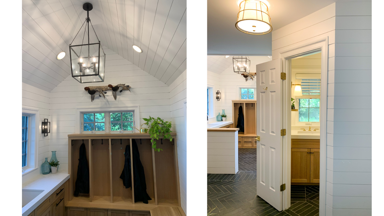
- Light- lots of light and statement lighting
- Clean design (lots of white) but something to make a design impact
Right away we knew we wanted our mudroom entrance to be stately because most of our guests used our garage door entrance and did not use our front door. Second must-have was cubbies for everyone. Thirdly, LOTS of light. I love plants so giving them a place to winter over was key. And lastly, for the laundry room, I knew I needed two things. First off I wanted to incorporate some sort of rod so that I could hang my delicate clothes and, secondly, I wanted some sort of organizational system for my three children and their PILES of clothes.
My Three Pillars- Detailed:
Organization
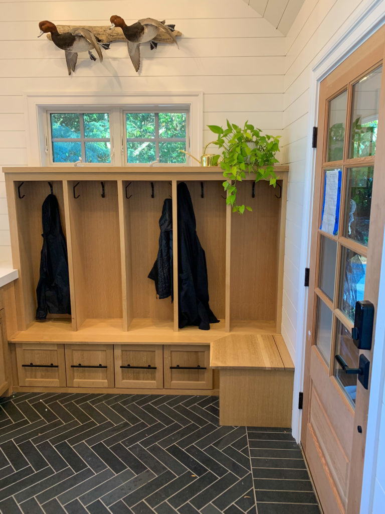
Contain, Contain, Contain. Where we live on the Eastern Shore of Maryland is an outdoorsman’s paradise, often appropriately dubbed God’s Country. There are boots, jackets, more boots and more jackets and then more after that. We are outside A LOT. And I wouldn’t change a thing. We quickly realized that what we needed versus what we could actually do was going to take a lot of creative thinking because of where we live. We live on the water in a critical area and, because of that, we had to go through a lengthy zoning process. This said, we tried to keep the area as small as possible so we ended up not being able to carve out a large enough space to put the laundry behind closed doors. So rather than conceal, our only option was to highlight (and make it pretty).
Lighting
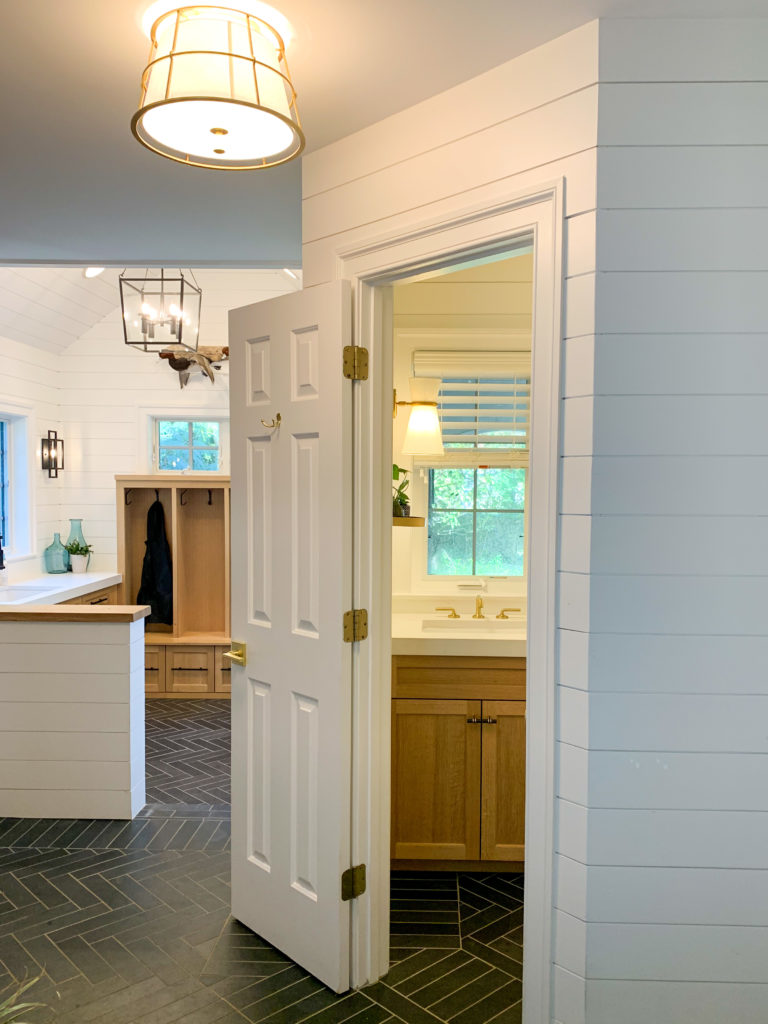
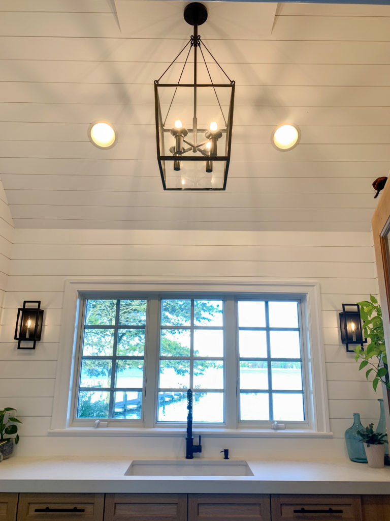
The first house we rehabbed was in our little town, Chestertown. While I LOVED it, because it was between two houses, it was always very dark! So when we moved into this house, one of the many reasons I fell in love was because of the beautiful windows that are everywhere. Also I have a plant addiction and I try to winter over as many plants as possible, so as much light as possible was at the top of the list.
Clean Design with Warm Touches
I love the clean, crisp lines of modern design. But I also love the timelessness of traditional design. I tried to combine the two ideas with all of the materials that we chose.
Finishes
Where to Start? Design is in the details and anyone who has ever done a construction or a remodel project knows how important all of those details are. Decision Fatigue is real but the benefits of persevering through each and every decision far outweigh throwing your hands up and submitting to the ordinary. When all of those details come together in just the right way, spaces really sing.
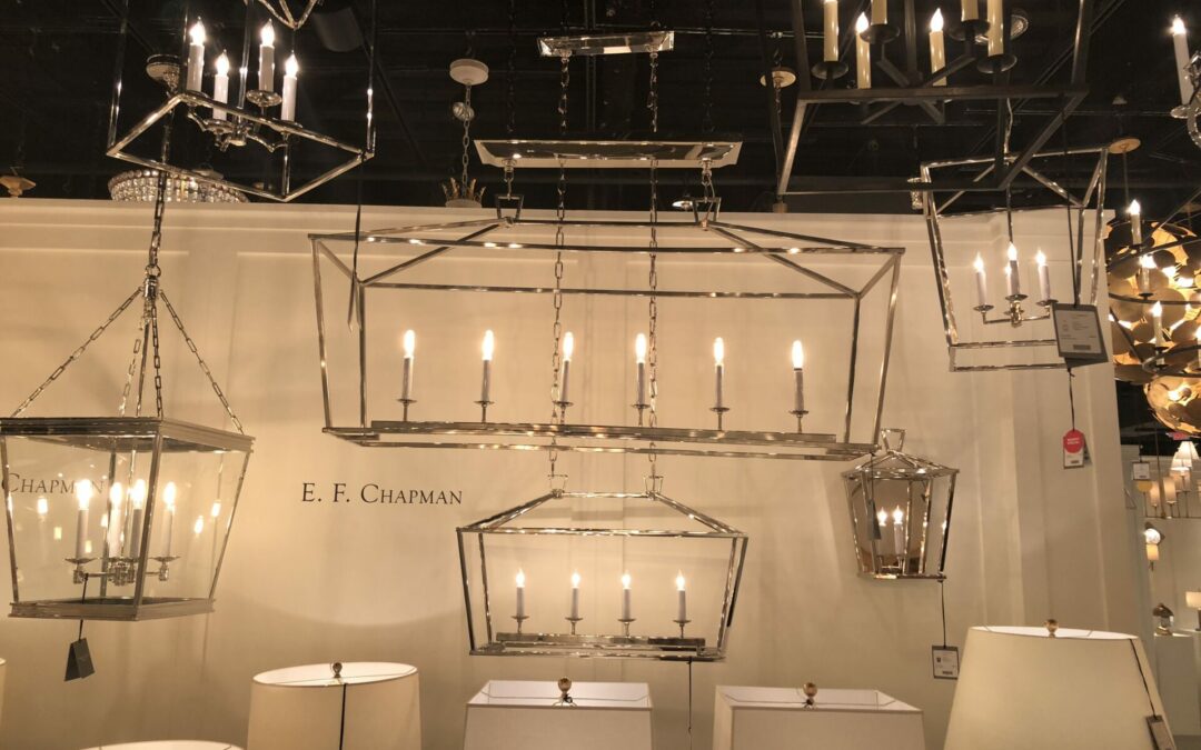
The lighting that you see in the photos was all purchased before the project even started. I love lighting very much and wanted to build all the rest of the finishes around the lighting. This ended up being perfect for me because I think the design, and its simplicity, really lets the lighting shine.
Exterior Lighting
I love two wall mounted exterior lights because I love symmetry. I also love how these fixtures have a modern feel, but also incorporate traditional elements such as the brass backplate which not only reflects the light, but also creates warmth.
Mudroom Sconces: Unlike the rest of our lighting, we added these sconces later in the game and I am SO happy we did. I love how they mirror the exterior fixtures. And having them on a dimmer is an added bonus because they cast the prettiest light at the end of a long day.
Lantern
I really hemmed and hawed over the lantern fixture. I knew I wanted a traditional lantern but wasn’t quite sure what the space needed. I ended up choosing this lantern because I loved the bold, clean lines coupled with all the openness of all of the glass.
Flush Mount: For the laundry area, I fell in love with this sweet flush mount. I loved the idea of pivoting this area to a mixture of brass and the black. And I felt like the scale and the amount of the soft brass set the tone for the area well.
Sconces: And finally for the bathroom, the minute I laid eyes on these sweet sconces it was love at first sight. I love the modern edge that the two shades bring but then there is that traditional nod with the beautiful brass.
* All Lighting used in this project can be purchased through the Village House.
Flooring
Since lighting was completed first, the next step for me was to pick out the flooring. That was really tricky because both my husband and I had loved the look of brick tile, but after some thought, decided that we wanted to do something different. So we settled on a 3×12 black slate tile with a dark gray grout. Before we even knew what tile we wanted, I knew I had to have a herringbone pattern set with a border. Because of the complexity of this pattern, I also wanted a slightly larger than standard grout line so we went with a ⅛” grout thickness. I also love the timberwolf gray because it hides ALL dirt and mess.
Cabinets
Another mainstay of the design aesthetic was to have white oak cabinets. I loved how they warm up the white space and really bring in character. Getting the stain right for the white oak was TRICKY! So many clear stains accentuate the yellow of the wood which I hated. It can be really easy to look “country” with oak and that was not the look I was going for. We finally found the perfect formula in a clear water based stain.
Fixtures & Hardware
I love mixing metals whenever I can in a space. For the mudroom I kept all of the fixtures matte black because I wanted to keep the overall aesthetic clean and uncomplicated. The laundry area is a transition area so I wanted to warm it up a little and use both brass and black.
Sources
Cabinet & Drawer Pulls- 6” Square Cabinet Pull
Cubby Hooks- Rejuvenation Double J Hooks
Mudroom Faucet- Vigo Edison Matte Pulldown Spray Faucet
Sources:
Laundry Room Cabinet Pulls- Elroy 8” Drawer Pull
Bathroom Pulls- Rejuvenation Elroy Finger Pulls
Bathroom Faucet- Pfister 8” Bathroom Sink Faucet Brushed Gold
Credits:
Plans: South and Main Designs
Foundation/Brickwork: Ben Herr Anthony’s Landscaping, Maurice Jones
Materials: Chestertown Lumber, Chesapeake Family Flooring
Cabinetry: Bob Matthews
Tile Install: Zierfuss Painting & Restoration
Shiplap/Carpentry & Painting: Zierfuss Painting & Restoration
Lighting: Village House

